Saturday, August 26, 2006

Peach Jam

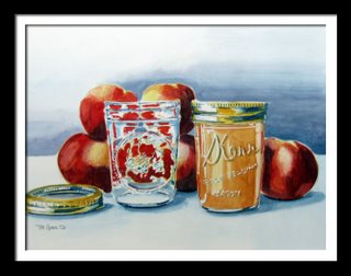
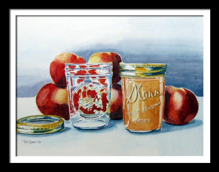
Okay, my last Mason jar. The challenge with this painting was to get the design on the empty jar right. The left hand jar is a Ball jar with the Ball logo on the back and an intricate design on the front. The design is a raised circle with a cornucopia of fruit in the middle.

In the past I've had trouble with dark reds and oranges as they get muddy quickly. With the peaches I started with a light yellow wash, then a slightly darker one. Next was a reddish orange wash and then another and then a dark red. Finally I added a light indigo wash on the darker areas.

I like the color of this painting and how the dark background makes the peaches and jars jump forward. I also like the reflection on the front of the right-hand jar.

Sunday, August 20, 2006

Sunday Morning


I was thinking of things to paint while doing a crossword puzzle. Hmmm. What about a painting with a puzzle in it? Maybe if I put the pencil and my glasses in the picture. . . but that's not enough color. I consulted with Carolyn and she suggested a mug. The Hilo Hattie Gift Shop mug fit the bill!

I really like the composition. The glasses, however, didn't distort the images behind them enough so I exaggerated them a bit. The shadows and shadow sides of object receive multiple layers of paint to get them dark enough to show 3 dimension. I spent more time on this painting than just about any other. Drawing it was quick and easy, but I decided not to use anything but watercolors (no pencil or pen) in the painting so there was a lot of detail work with the lettering and lines. I over-worked a few areas, but in general I'm satisfied with this painting. The painting is 24" x 18" unframed or 30" x 24" framed.

Sunday, August 13, 2006

San Francisco Palace of Fine Arts


(Click on image to enlarge it)
And now for something completely different. This painting is from a photo I took when we visited San Francisco in March. The Palace of Fine Arts was built for the 1915 Panama-Pacific International Exposition celebrating both the discovery of the Pacific Ocean and the completion of the Panama Canal. It was also a way to celebrate San Francisco's resurrection from the 1906 earthquake. The palace was constructed by the city on landfill that is now the Marina District with it's expensive homes. Not exactly earthquake proof.

This painting is a departure from what I have been panting mostly because of the detail. I think a painting like this either needs to be a loose abstraction or extremely realistic. Unfortunately I probably fell somewhere in between.

The most difficult part of the paintings was getting the fluting on the columns to look right as well as the shading on the columns. I simplified some of the detail work and even invented a few things. My apologies to the architect Bernard R. Maybeck.

The part I like best are the shadows on and near the reddish columns.

Sunday, August 06, 2006

TOOLS OF THE TRADE

(Click on image to see larger view)
Okay, this might be my last canning jar painting. I've played with the light and reflection of the jar in three paintings now. I like how having water in the jar of this painting refracts the light of the brushes and the light from the background. My favorite parts of this painting are the ferrules (metal part of the brush). I've worked at understanding how the raised lettering on the glass can be painted. Each painting has shown more lettering as I got a bit better at it. I added some blue at the very end to the "Wide Mouth" at the bottom of the jar and it seemed to make it more realistic.

Initially I was going to have an unfinished painting in the background, but I decided that it would be too distracting from the focus of the painting.